ISTA 301 Blog: Awesome Visualizations I've been saving for a Blog Post
Data Visualization is cool, lets just admit it. And coming up with an intuitive way to do it certainly takes a lot of creativity. Plus some of them are pretty.
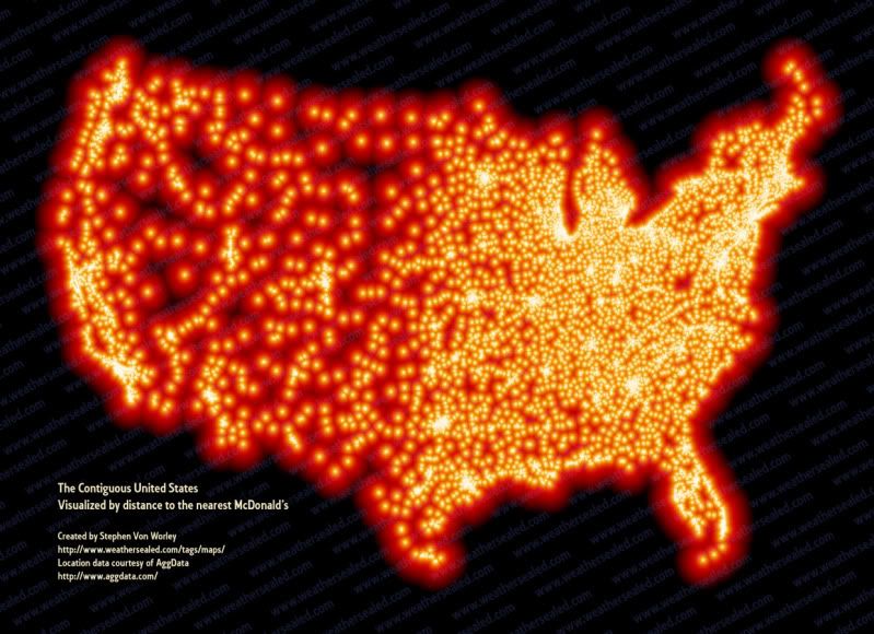
The darker spots on this map are the spots that are furthest from a McDonalds. Purdy!
No comments:
Post a Comment